Designing The Future of Energy - Mojo
Client
Mojo Energy Pouches
Year
2025
Summary
Every choice nicotine made, we made the opposite.
Description
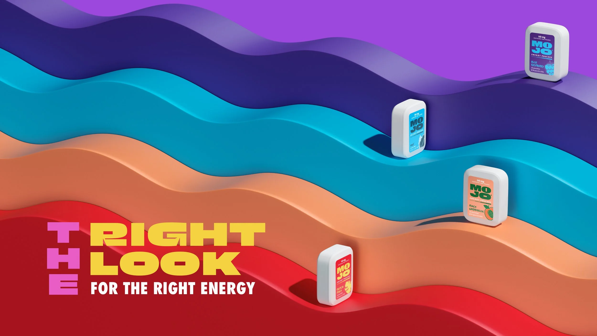
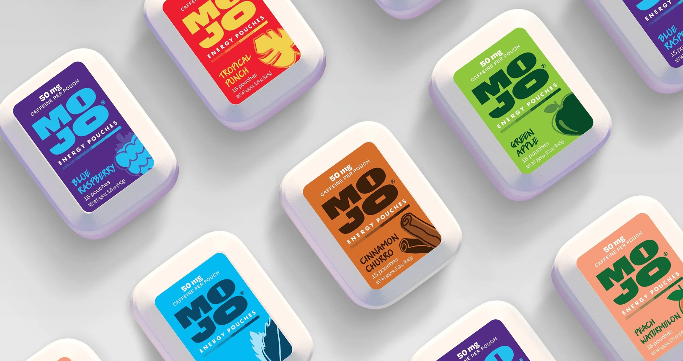
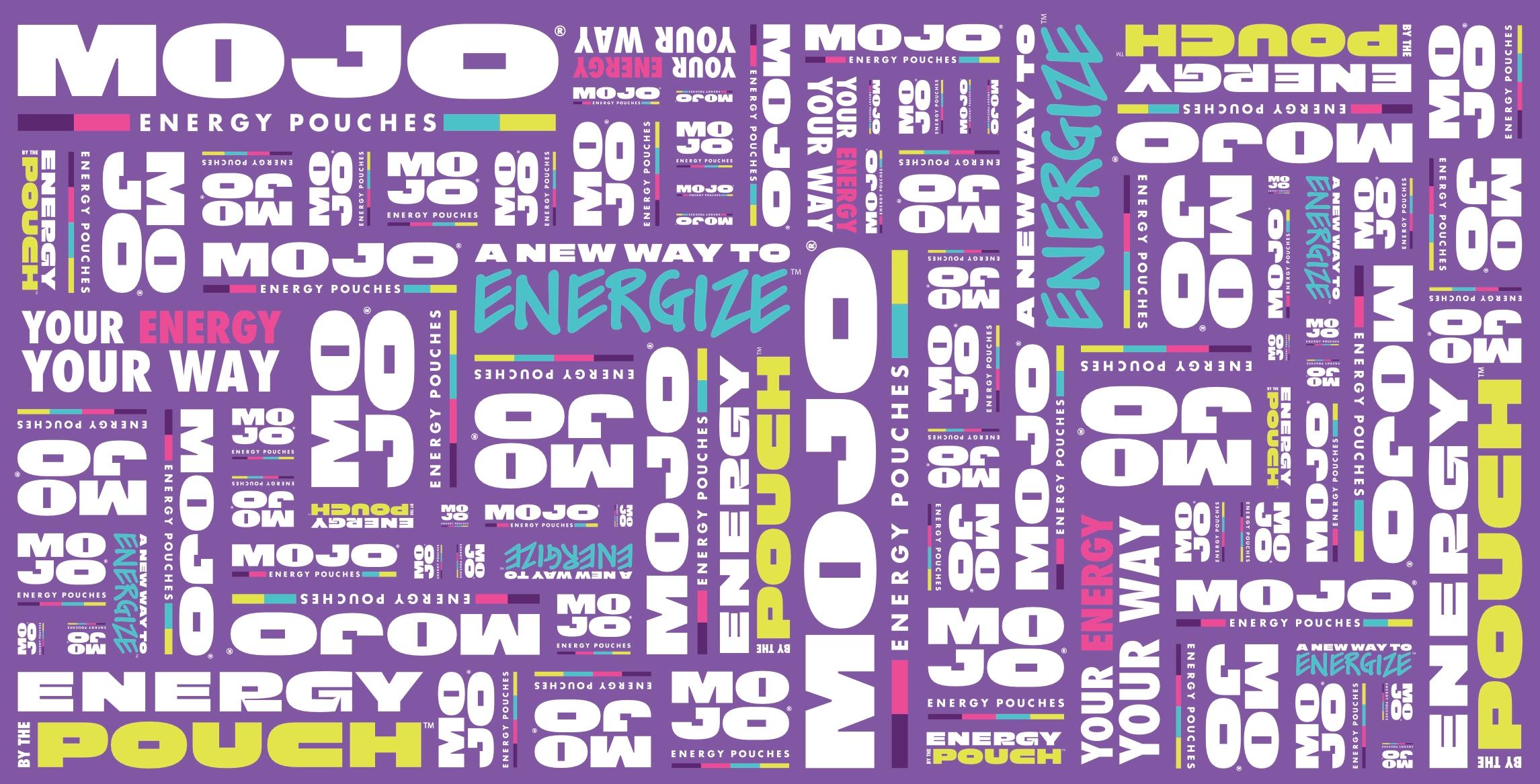
Caffeine pouches borrowed everything from nicotine: the can, the wintergreen, the spot behind the counter. Most people had never seen one. The ones who had assumed it was tobacco. So Mojo got one rule. If nicotine does it, Mojo doesn't. Then we designed every element against it. Pack. The round can became a slider that would look lost in a tobacco case. Mark. The pouch sits inside the O's of the wordmark. The brand explains the product before you read a word. Color. The shelf ran on tobacco brown and clinical white. Mojo runs on purple. Flavor. Wintergreen made room for Blue Raspberry, Tropical Punch and Peach Watermelon. Motion. The color wave never spikes or crashes. Neither does the product. Photography. Nicotine hides behind an age gate. We put the pouch on a tongue and ran it on YouTube. The result is an energy brand that happens to be a pouch.
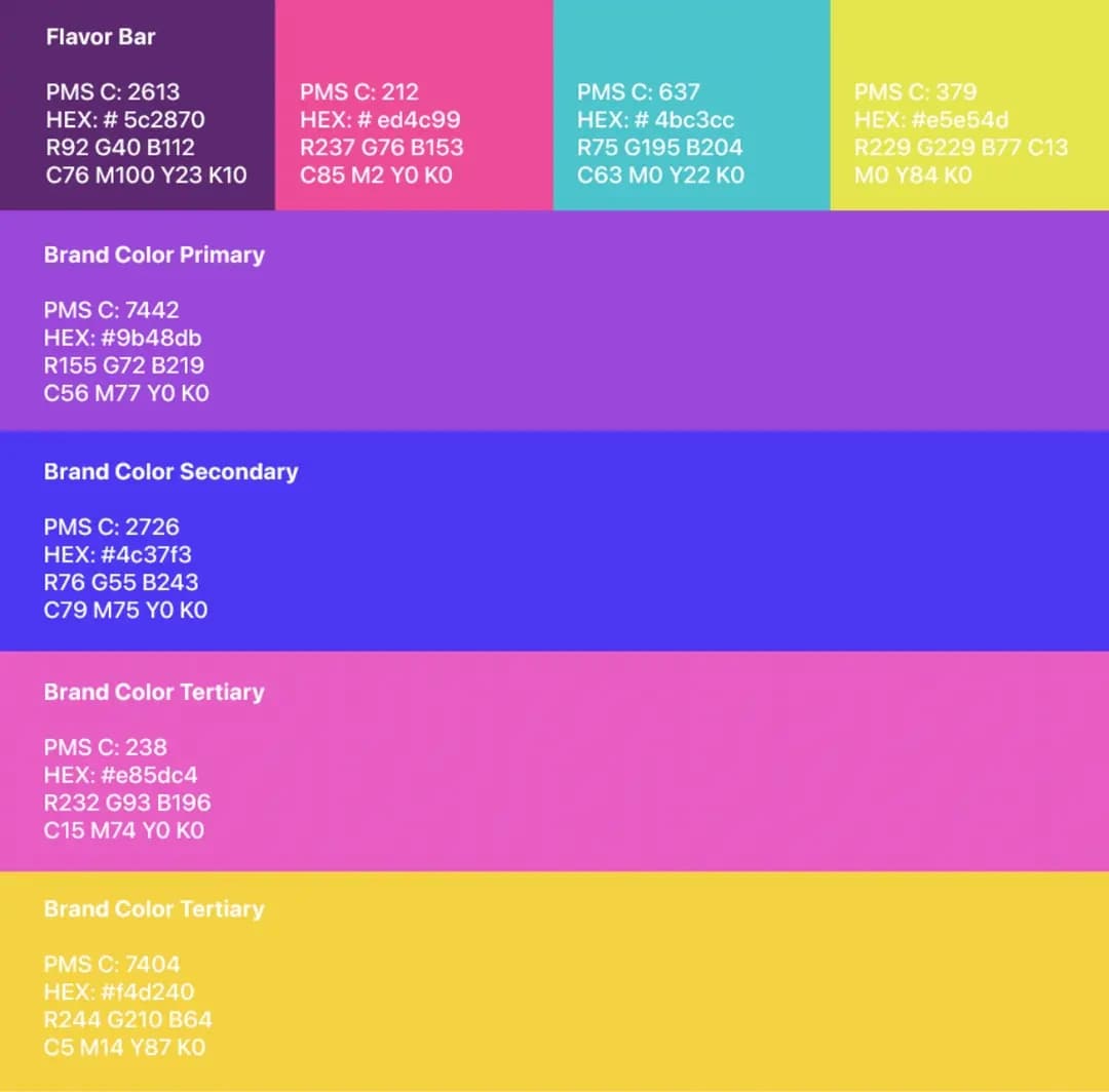
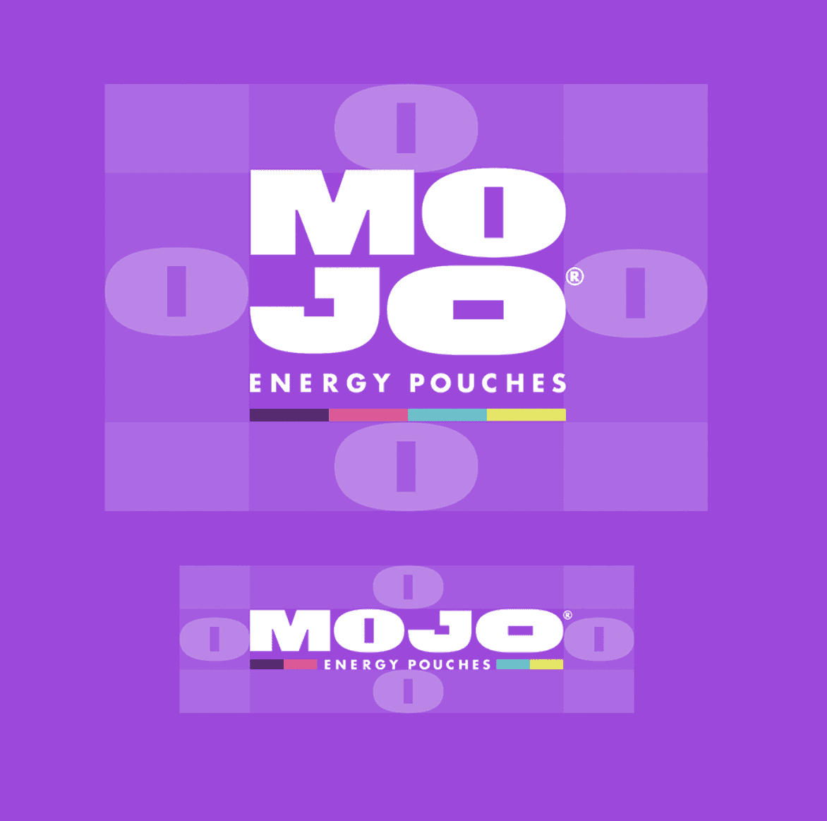
full branding and package redesign
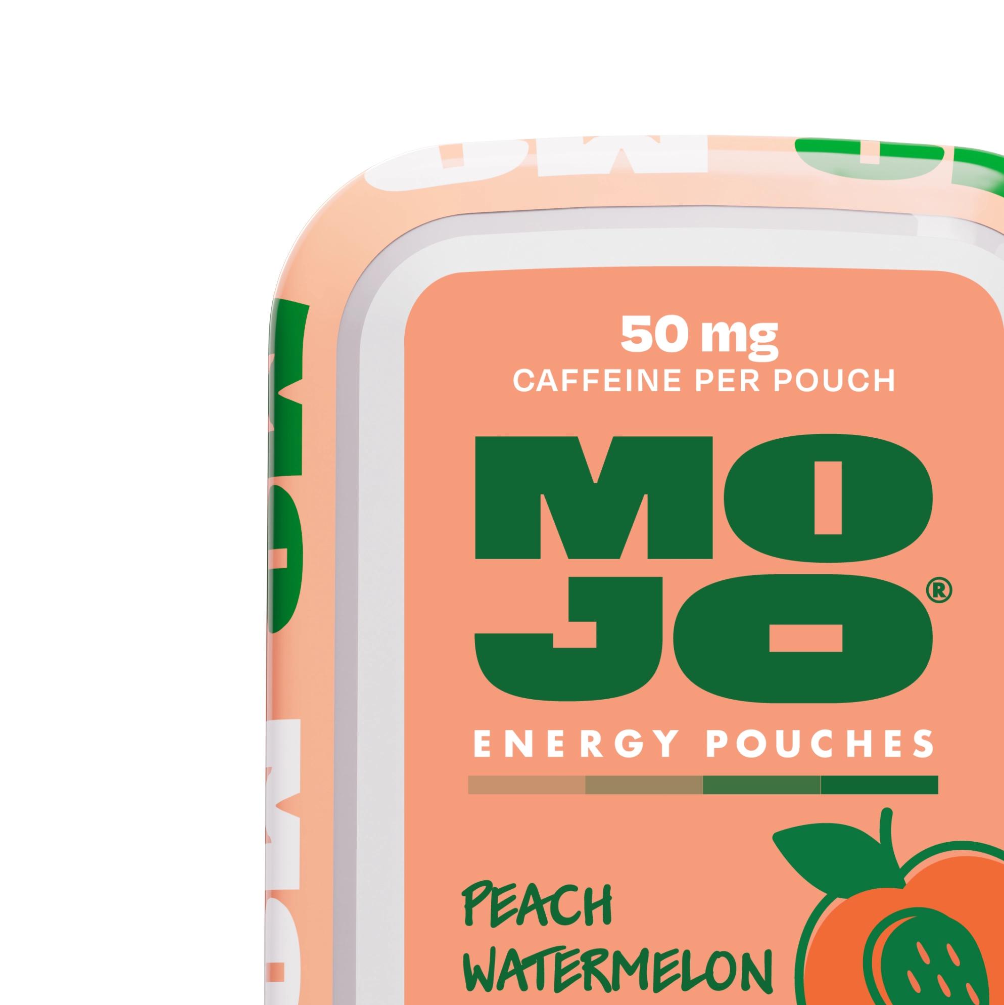
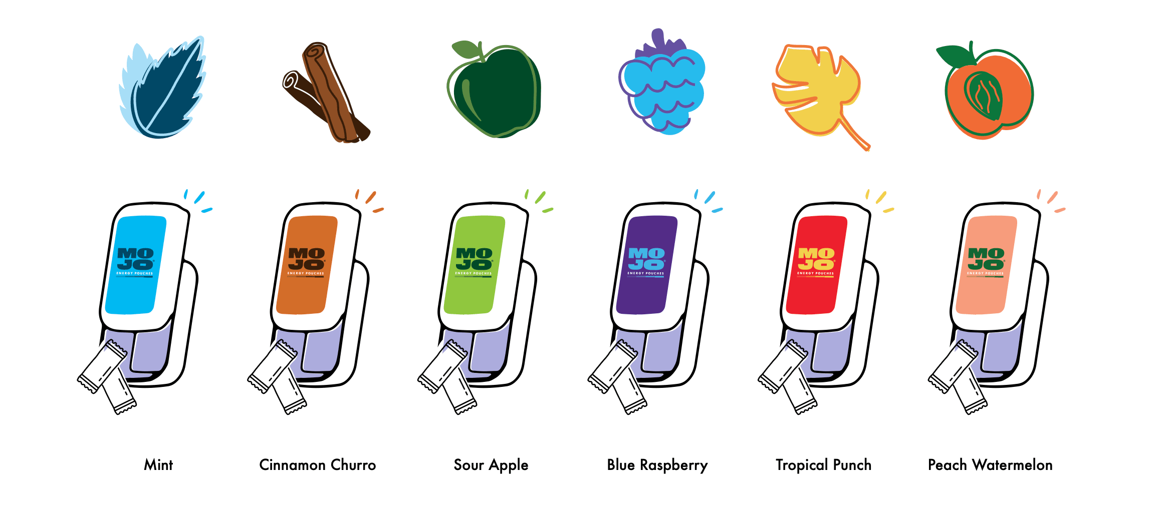
- Peach Watermelon
- Tropical Punch
- Mint
- Blue Raspberry
- Cinnamon Churro
- Green Apple

Next project